
Mobile Optimization Tips with Shoptimity
In today's digital landscape, mobile optimisation has become essential for any online business. With more customers shopping on their smartphones than ever before, ensuring your store performs flawlessly on mobile devices is no longer optional.
Mobile users expect fast loading times, intuitive navigation, and seamless checkout experiences. Meeting those expectations is what turns a phone browser into a paying customer.
Why Mobile Optimisation Matters
The majority of online shoppers now browse and purchase using their mobile devices. A poorly optimised mobile experience leads to higher bounce rates, abandoned carts, and lost revenue. A mobile-first approach does the opposite — it can significantly boost your sales and customer loyalty.
Search engines also prioritise mobile-friendly websites in their rankings. That means better mobile optimisation improves your visibility and drives more organic traffic to your store.
Key Mobile Optimisation Strategies
Adapt to Every Screen
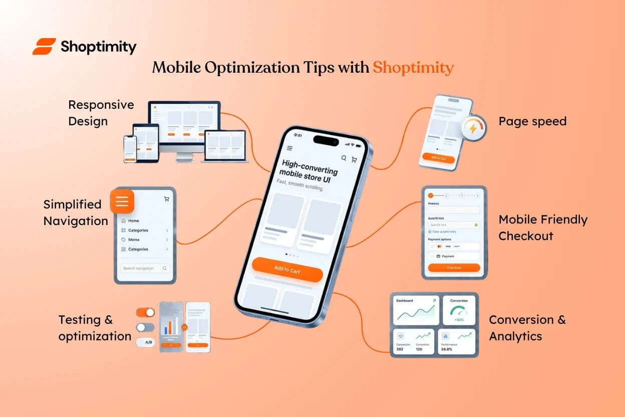
Responsive design is the foundation of mobile optimisation. Your store should automatically adjust to different screen sizes, providing an optimal viewing experience whether customers are on a phone, tablet, or desktop.
Load Fast on Any Connection
Page speed is critical on mobile, where users often have slower connections. Compress images, minimise code, and leverage caching so your pages load quickly and visitors don't bounce before they see your products.
Simplify the Path to Products
Simplified navigation helps mobile users find what they're looking for without frustration. Use clear menus, prominent search functionality, and logical product categorisation so the next tap is always obvious.
Make Mobile Checkout Effortless
A mobile-friendly checkout reduces friction in the purchasing process. Minimise form fields, offer guest checkout, and ensure payment methods are easily accessible so customers can complete their order in seconds.
Testing and Continuous Improvement
Mobile optimisation is never finished. Make these checks a regular habit:
- Test your store on a range of mobile devices and browsers.
- Monitor user behaviour to see where people hesitate or drop off.
- Track conversion metrics before and after each change.
- Gather customer feedback to identify areas for improvement.
Small optimisations can lead to significant gains in performance and revenue.
Give every mobile shopper a flawless experience
A mobile-first theme with responsive layouts, fast load times, and a frictionless checkout built in — so phone browsers become paying customers.
$19/month or $160/year (save 30%) — 7-day free trial, no hidden charges.
Continue Reading

Comparing Shoptimity vs Other Shopify Themes: Which Solution Fuels Your Brand’s Growth?
Choosing the right Shopify theme shapes every aspect of your ecommerce operation — from first impres...
How to Start Dropshipping on Shopify with Shoptimity — From Zero to First Sale
No inventory. No warehouse. No upfront stock costs. Just a smart store, the right theme, and a plan ...

How to Increase Your Shopify Conversion Rate in 2026 (11 Proven Tactics)
If you're driving traffic to your store but sales aren't keeping pace, your conversion rate is almos...