
How to Optimize Shopify Mobile Checkout for More Sales
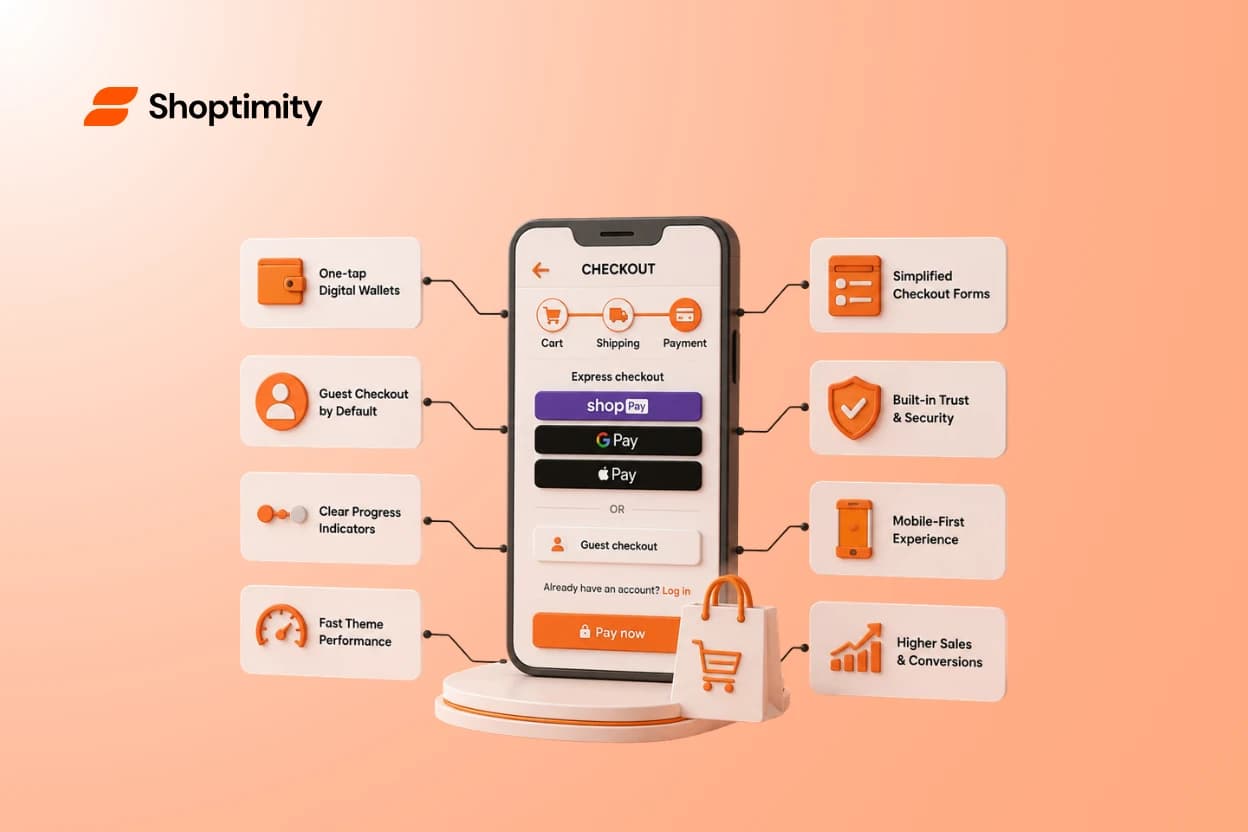
Imagine watching a customer walk up to your cash register, pull out their wallet, and suddenly drop their items to walk out the door. This frustrating scenario happens thousands of times a day online when a store ignores the importance of a fast shopify mobile checkout. Mobile buyers demand speed and convenience, yet many default storefronts force them through slow, tedious forms.
Most online traffic comes from smartphones, but mobile conversion rates notoriously lag behind desktop. The gap almost always comes down to friction at the final payment step. You can have the best products and the most persuasive copy, but if a thumb-typing buyer gets frustrated at the payment screen, you lose the sale.
Key takeaways:
- Enable express digital wallets like Shop Pay to bypass manual data entry.
- Hide optional form fields to keep the payment screen clean and short.
- Always offer a prominent guest checkout option to prevent login fatigue.
- Fast theme architecture is critical for keeping impatient mobile buyers on the page.
What Is a Shopify Mobile Checkout?
A shopify mobile checkout is the specific sequence a customer navigates to finalize a purchase using a smartphone or tablet. It encompasses the cart review screen, the data entry forms for shipping details, and the final payment gateway.
Unlike desktop users with full keyboards, mobile shoppers are easily distracted and working with limited screen space. They do not have the patience to manually type out a 16-digit credit card number or correct autocorrect mistakes in their shipping address. The core goal of mobile checkout optimization is removing every possible hurdle between your customer and the final payment button.
Why Mobile Buyers Abandon Carts Just Before Paying
Mobile ecommerce shoppers leave their carts behind for highly predictable reasons. The most common conversion killer is forcing account creation. When a shopper just wants to buy a single t-shirt, demanding they invent a new password creates instant frustration.
The second major issue is form fatigue. Too many stores leave every default Shopify field active. If you do not actually need a customer's company name or a secondary address line, those fields are just visual clutter. Every extra field requires another tap, another keyboard pop-up, and another chance for the user to abandon the process.
Finally, slow loading speeds destroy buyer trust. When a customer taps the checkout button and stares at a blank screen for three seconds, they assume the site is broken. We see this constantly when auditing stores bogged down by complex code and overlapping third-party apps. Buyers simply close the tab and move on.
Core Strategies to Optimize Shopify Checkout for Phones
If you want to stop losing money at the finish line, you need to actively optimize Shopify checkout flows for small screens. Here are the most effective adjustments you can make today.
Prioritize one-tap digital wallets Turn on Shop Pay, Apple Pay, and Google Pay immediately. These express options instantly autofill shipping and payment details using stored data. According to Shopify's own data on Shopify Checkout, Shop Pay powers 12% of US ecommerce. Furthermore, Shopify's overall conversion rate outpaces the competition by an average of 15% largely due to these accelerated options. One tap is infinitely better than fifty keystrokes.
Offer guest checkout by default Make the guest checkout path the most obvious choice on the screen. Do not hide it below a massive login prompt. Let the user buy the item first. You can always offer an account creation button on the final order confirmation page after the money has changed hands.
Use visual progress indicators Mobile screens lack context. Shoppers need to know exactly how many steps are left. A simple visual bar at the top of the screen showing "Cart > Shipping > Payment" reduces anxiety. The Mobile Checkout: Best Practices guide highlights that keeping the process intuitive and transparent prevents users from abandoning the flow out of frustration.
The Role of Theme Speed in Payment Completions
No amount of checkout tweaking matters if your cart page takes too long to transition to the payment gateway. Mobile storefronts require incredibly fast architecture. If your site speed is sluggish before the buyer even reaches the payment screen, you need to learn how to fix core web vitals on Shopify for faster speeds.
Many merchants try to patch a low-converting store by installing dozens of optimization apps. This creates bloated code that slows down the mobile experience. The smartest fix is relying on a fast, native framework that has conversion features built directly into the code.
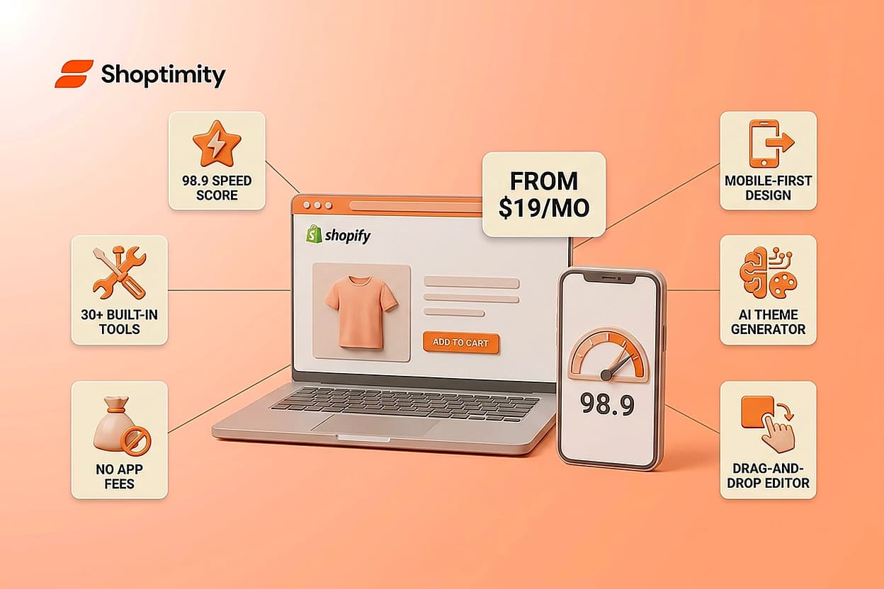
For example, Shoptimity themes are built natively on Shopify Online Store 2.0 architecture with zero legacy liquid files. This clean codebase delivers lightning-fast load times and a 98.9 speed score. Instead of stacking expensive apps that slow down your mobile layout, you get over 30 built-in tools like quantity breaks and sticky carts. Our merchants average a 44% conversion rate lift post-launch simply because a fast, mobile-optimized foundation naturally drives more completed checkouts. To see how a native design improves performance, explore our best mobile first Shopify themes for 2026.
Ready to build a faster, higher-converting store?
Every Shoptimity theme ships with conversion widgets built in — so you get speed and features without stacking apps.
7-day free trial · all themes included · cancel anytime
Continue Reading
Why Merchants Choose Shoptimity: Speed, Conversions, and Built-In Tools
Over 10,000 Shopify merchants have switched to Shoptimity. They're tired of paying $50–$150 monthly ...

Shopify Themes With Sticky Add to Cart: Which Ones Actually Convert in 2026
A sticky add to cart button stays visible as customers scroll through your product page. It's one of...
How To Choose A Shopify Mobile First Theme In 2026
Every second of mobile load time costs you roughly 7% in conversions. Most merchants try to fix slug...