
Product Quick View & Smart Filters: Essential Tools for High-Ticket E-Commerce in 2026
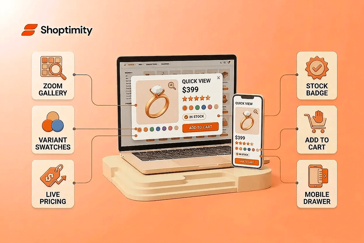
You're selling a $400 ring or a $2,000 golf simulator. Your customer narrows your collection by budget, material, and brand. They hover over a product, see the details without leaving the page, and decide in seconds whether to dive deeper or move on. That moment of frictionless discovery is what separates stores that convert from ones that watch buyers bounce away silently.
TL;DR: Smart filters and product quick view are non-negotiable for high-ticket e-commerce. Shoppers using filters view 3 times more products and convert at higher rates. Quick view eliminates page-load friction that kills conversions on mobile. Together, they reduce bounce rates, increase average order value, and build the trust premium buyers demand.
What Are Product Quick View and Smart Filters?
A product quick view is a lightweight popup that displays key details, price, images, size/color options, and an add-to-cart button without forcing the shopper to navigate to the full product page. Smart filters are faceted navigation tools that let customers narrow a collection by attributes that matter to their buying decision: price, size, color, brand, material, or niche-specific specs like diamond carat or telescope aperture.
Neither is new, but execution matters enormously. Most e-commerce sites use them badly. According to Baymard Institute research, 76 percent of major e-commerce sites have filter usability issues severe enough to cause abandonment. The problem isn't the concept; it's the design.
Why High-Ticket E-Commerce Demands Better Navigation in 2026
High-ticket dropshipping operates on a different model than volume-based e-commerce. Instead of chasing constant sales volume, you compete for fewer, higher-value transactions with customers who research extensively, compare alternatives, and expect professional treatment. These buyers invest significant money and want clarity fast.
In 2026, the global online jewelry market is projected to reach $85.7 billion, growing at a 13% compound annual growth rate. Jewelry exemplifies the high-ticket category: strong average order value (often $150 to $400+ per piece), minimal shipping and reverse logistics costs, and buyers who filter obsessively by material, style, and price before committing.
But the logic applies across all premium niches. Whether you're selling luxury furniture, high-end consumer electronics, custom project components, or specialty equipment, your buyer needs to navigate large catalogs confidently. A poor filter experience signals amateurism. A smooth one signals a professional brand worth trusting.
How Smart Filters Reduce Friction and Drive Revenue
When shoppers use smart filters effectively, they view three times more products than shoppers who don't. This isn't because filter users are more motivated; good filter UX surfaces the right products faster, eliminating friction that kills purchases.
Smart filters work by addressing real shopper questions. Instead of forcing someone to page through 200 items or use a search bar they're unsure about, filters answer: "Show me only rings in white gold under $500" or "Display furniture under 6 feet wide with free shipping." Each question a filter answers removes one barrier to discovery.
For high-ticket stores, this matters because your shopper pool is smaller and more deliberate. They've already decided to spend money; your job is to get them to the right product before they second-guess themselves.
Build filters around the attributes your customers actually compare, not every field your admin supports. Many store owners enable all available filters because the platform allows it. The result: shoppers face dozens of options, half irrelevant, and abandon the catalog in frustration. Fewer, relevant filters win every time.
Effective high-ticket filters typically include:
- Price range sliders or clear price bands
- Material or composition (metal type, fabric, finish)
- Size or dimensions (critical for furniture and apparel)
- Brand (if you carry multiple premium brands)
- Stock status or availability
- Niche-specific attributes that affect the buying decision
Test which filters your customers actually use. If a filter sits unused for a month, remove it.
Building a Quick View Experience That Actually Converts
Product quick view solves a mobile-specific problem: loading a full product page over a slower connection takes time, and time kills intent. Quick view keeps the shopper on the collection page, shows essentials in a popup, and lets them add to cart or explore further without friction.
High-ticket quick view should include:
- Primary product image with zoom capability
- Price and any discount or savings messaging
- Available options (size, color, material variants)
- Stock status ("In stock" or realistic delivery timeframe)
- Add-to-cart button (or "Request a quote" for custom items)
- A link to the full product page for deep-dive specs
On mobile, where over 80% of browsing happens, quick view is the difference between converting and losing the sale. A full product page load on a slower connection costs real revenue. Optimizing Shopify mobile checkout becomes even more critical when your visitors are browsing on smaller screens.
When implementing quick view on your Shopify store, ensure it loads fast and stays responsive. Clunky popups that lag or require multiple taps feel unprofessional on a $2,000+ purchase. The experience should feel premium because the product is.
Common Mistakes That Kill Filter UX and How to Fix Them
Mistake: Auto-applying every filter instantly. Many stores update the product grid the moment a shopper selects a filter. On mobile, this forces constant scrolling back to open the next filter option. Instead, let customers select multiple filters at once, then apply them manually or use smart auto-apply that doesn't auto-scroll.
Mistake: Hiding applied filters. If a shopper has selected "under $500" and "leather," make that visible at the top of results. Many sites bury this information, and shoppers forget what they've filtered.
Mistake: No reset option. A one-tap "clear all filters" button is essential. Without it, shoppers feel trapped and leave.
Mistake: Poor mobile filter design. On desktop, a sidebar works fine. On mobile, that same sidebar doesn't. Use a drawer or modal that's fast and tappable. Test your filters on a real smartphone over a slower connection before launch. If filtering feels fiddly or slow, that's your answer.
Mistake: Filter persistence issues. When a shopper applies filters, navigates to a product detail page, and clicks back, those filters should remain. Losing their selection kills conversions.
Recent research on filter design patterns found that faceted navigation, mobile drawer design, price sliders, active filter display, and URL structure for SEO all contribute to conversions. Each requires intentional design, not default settings.
Shopify themes with product filtering built natively eliminate friction without requiring apps or developer time. Many store owners solve these problems through theme selection alone. The faster your store, the faster your customer decides, and the higher your conversion rate climbs.
===ARTICLE===
Launch a High-Converting Store in Days
You now know why smart filters and quick view matter for high-ticket sales. Start building a store with these features built in—no apps, no friction. Shoptimity themes ship with product quick view and smart filters out of the box, ready to
7-day free trial · all themes included · cancel anytime
Continue Reading
Why 30+ Native Apps Beat Building a Shopify Store Without Them in 2026
Most Shopify store owners are hemorrhaging money on the wrong things. You're paying $10 to $49 per m...
98.9 Speed Score: Why High-Ticket Dropshippers Need Lightning-Fast Shopify Themes
Every second your store takes to load costs you money. For high-ticket dropshippers selling products...
Launch a Conversion-Optimized Shopify Theme Without Coding in 2026
Most dropshippers and brand builders waste thousands of dollars on developer fees and monthly app su...