
Boosting Sales with Smart Design in Shoptimity
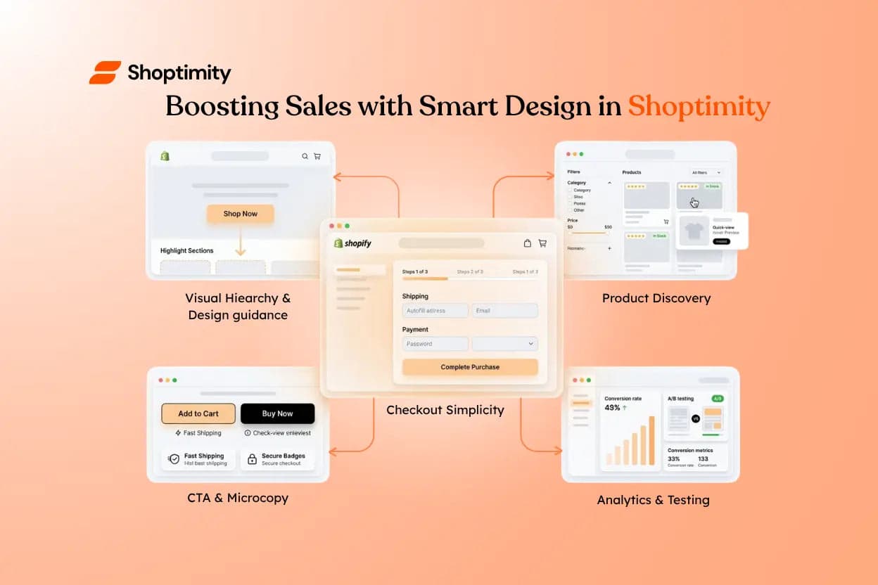
Smart design is about more than aesthetics — it subtly guides customers toward the actions you want them to take. Combined with Shoptimity's fast, accessible components, intentional design creates an experience that feels effortless for shoppers and more profitable for your store.
Five Principles of Design That Converts
Design That Guides Customers
With Shoptimity's components, visual hierarchy, clear calls-to-action, and purposeful microcopy work together to reduce friction and increase conversions. Small details — size, colour contrast, and spacing — communicate priority and make the path to purchase obvious. Consider accessibility and performance together: faster, more accessible pages keep users engaged and build trust across devices.
Frictionless Product Discovery
Help shoppers find the right product quickly with meaningful filters, consistent imagery, and clear affordances. Shoptimity's templates are built for quick scanning and make it simple to highlight what matters:
- Surface price, features, availability, and social proof such as reviews or scarcity badges.
- Group related products and offer quick previews.
- Keep filters visible on larger viewports so users refine results without losing context.
- Use clear primary actions (Add to cart / View details) and lightweight modals to keep momentum.
Checkout Simplicity
A streamlined checkout reduces cart abandonment. Use Shoptimity's opinionated forms, focused layouts, and optimised input patterns to keep the purchase flow brief and predictable:
- Reduce form fields wherever possible.
- Show progress indicators and clear error messaging.
- Keep payment options visible and trustworthy.
- Offer guest checkout, saved details, and mobile-first inputs (tel, email, autocomplete).
Conversion-Driven Copy & Visual Signals
Design and copy work together: a concise headline, supportive subcopy, and microcopy near inputs or CTAs can remove objections. Place trust signals — guarantees, fast shipping, reviews — near CTAs, and use affordances like shadows and motion to draw attention to interactive elements without overwhelming the page. Test different microcopy on critical touchpoints; sometimes a single word change lifts conversions significantly.
Test, Measure, Repeat
Small design changes compound. A/B test CTA text, hero layouts, badge placement, and image cropping to learn what moves the needle:
- Measure conversion rate, revenue-per-visit, and average order value to prioritise high-impact decisions.
- Keep experiments small and focused so you learn faster.
- Instrument events (clicks, adds-to-cart, drop-off) and tie them to revenue to quantify impact and scale wins.
By combining intentional layout with Shoptimity's fast, accessible components, you create an experience that feels effortless for shoppers — and more profitable for your store.
A quick checklist
- Simplify choices.
- Highlight benefits.
- Reduce friction in checkout.
- Make testing part of your regular release cadence.
Design a store that guides every shopper to "buy"
Fast, accessible, conversion-focused components — so intentional design and clear copy do the selling for you.
$19/month or $160/year (save 30%) — 7-day free trial, no hidden charges.
Continue Reading

Shopify Themes With Product Filtering
Give a shopper 200 products and no filters, and most will leave before finding what they want. Give ...
Shopify Themes With Mega Menu: What to Look For
A mega menu can turn a big catalog into an easy browse — or a wall of links nobody reads. The differ...

How to Reduce Cart Abandonment on Shopify (2026 Guide)
Quick answer: roughly 7 in 10 carts are abandoned, and the causes are boringly consistent: surprise ...