Back to Blogs
Mobile PerformanceUX|
Apr 29, 2026
|2 min read
Built for Mobile-First: Responsive Design in Shoptimity
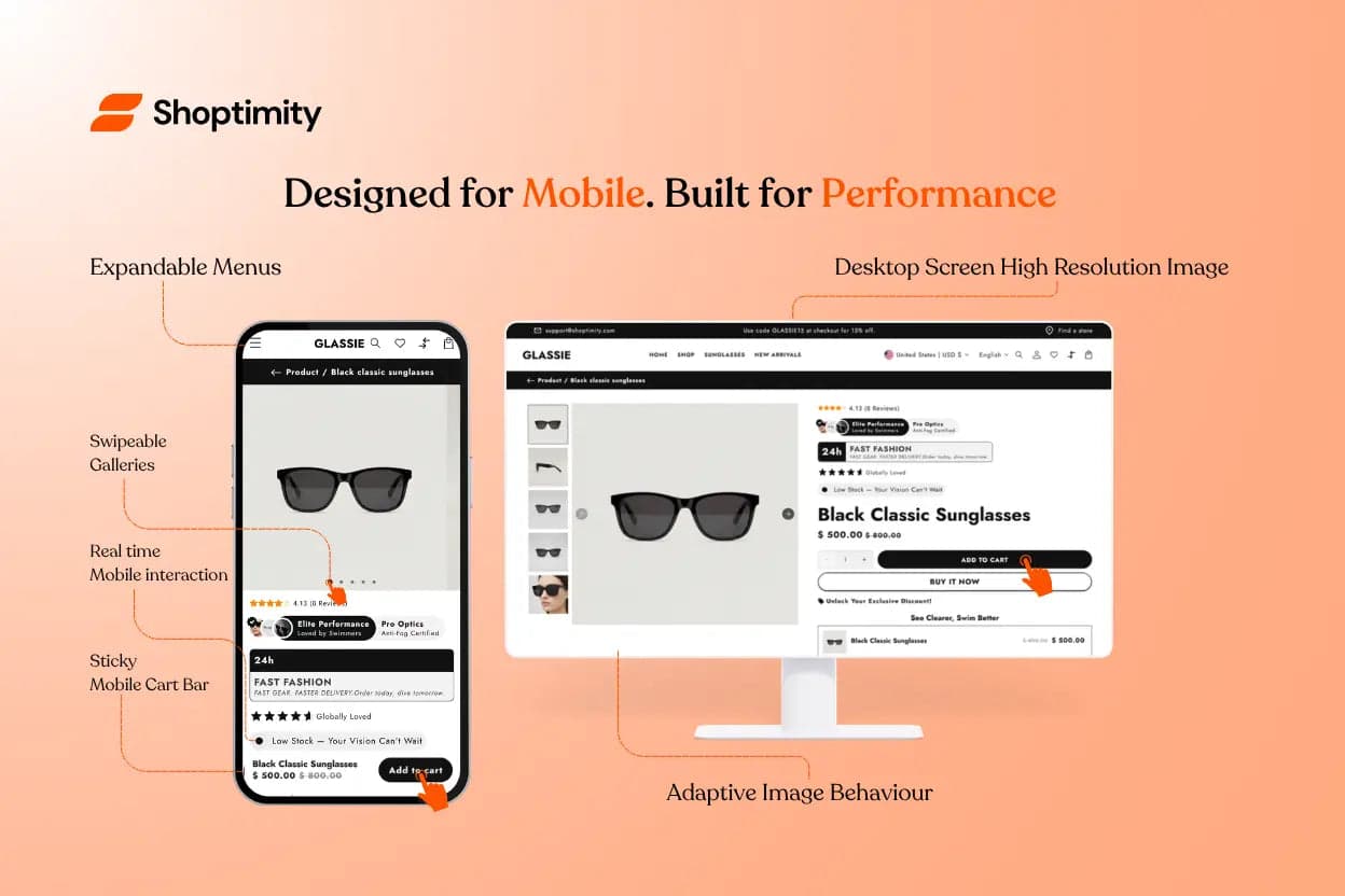
More people shop on mobile than ever before. A mobile-first design is essential — and Shoptimity delivers, built with mobile responsiveness and usability as a priority.
Mobile devices have different needs than desktop: smaller screens, touch navigation, and often slower network connections. Shoptimity's layout and elements are optimised for exactly these conditions:
Shoptimity uses adaptive (responsive) images that load the right size for each device. High-resolution images are reserved for desktop and large screens, while smaller files load on phones — saving data and speeding up loading on mobile networks.
Shoptimity goes beyond layout to improve how people interact on touch devices:
Product image galleries support swipe gestures, so customers browse photos with a finger.
A compact cart button stays fixed at the bottom of the screen, making it easy to add to cart without scrolling up.
Navigation collapses into a hamburger icon on mobile — saving space while keeping fast access to categories.
These choices mean mobile visitors aren't frustrated by elements designed only for desktop. Shoptimity treats mobile first, ensuring a smooth experience.
A seamless mobile experience directly influences sales. When shoppers can easily tap to buy and see clear calls-to-action, conversion rates go up. Shoptimity maintains all of its conversion features on smaller screens — upsell popups, countdown timers, and more — adapted for touch.
The result is an optimised conversion funnel, no matter what device a customer uses.
A genuinely mobile-first theme — adaptive images, touch-friendly interactions, and every conversion feature built to work on the small screen.
$19/month or $160/year (save 30%) — 7-day free trial, no hidden charges.

Activewear ecommerce demands precise execution and fast adaptation. Trends shift quickly, margins ar...