
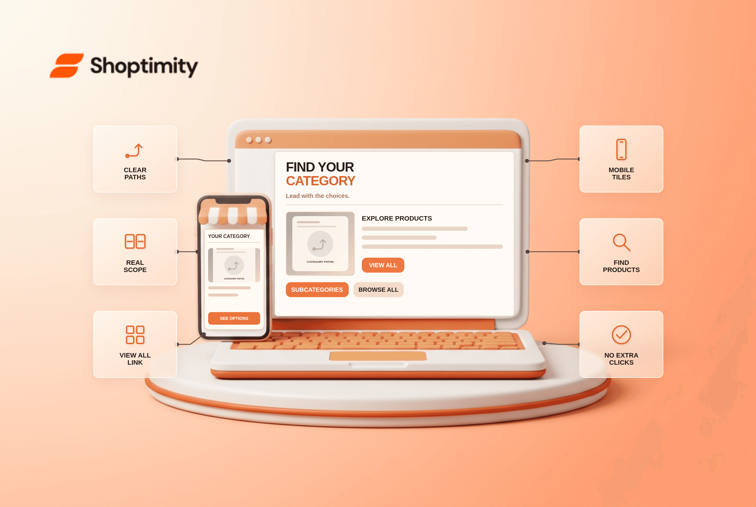
Ecommerce intermediary category pages should expose subcategories, show their scope and offer a clear View All path before promotional content. Start by testing one real customer journey and one exception before changing a template. The store needs accurate underlying data; a theme can present it, but cannot make an incorrect warehouse, catalog or payment record true.
What does the research say about ecommerce intermediary category page?
Use the finding as a diagnostic, not a conversion forecast. According to Baymard’s 2025 navigation review, 76% of studied sites did not make subcategories the primary content of intermediary category pages. A large campaign banner can leave shoppers looking for the actual product paths.
Baymard’s intermediary-page research reported that 13% of its benchmarked sites did not provide such pages. It also found that some users want to bypass the page, so a View All path matters.
When does a category hub help?
Lead with the fact that changes the decision. Use category hubs when the catalog has enough distinct types for a choice to help. Put clearly named subcategories with representative images first. Each tile should state its full scope; a “Beds” tile under “Pets” should not send a shopper to human bedding. Offer View All for people who know the broader type and want to filter the entire selection.
A tools store opens its Power Tools hub with a sale hero and four sponsored products while drills, saws and sanders are below several screens of content. A visitor who does not see the drill path may think the store only sells promoted tools. Move the category choices above the campaign.
Where should View All lead?
Keep the message consistent after selection. A card, form or account screen is only one view of a wider system. Update the customer-facing display when the selection changes; preserve the relevant detail in cart, checkout and confirmation where applicable. If a feature depends on backend rules, give the owner of those rules a concrete test case before promising behavior in editorial copy.
How can a team test this before launch?
Test the edge case that makes the promise fail. Use a representative product, location or account alongside the happy path:
- Map the first two taxonomy layers before designing tiles.
- Test every tile against the correct category destination.
- Provide a View All link for the actual parent product set.
- Check category scope is explicit in mobile link text.
- Inspect headings, image labels and breadcrumb hierarchy.
- Test a small catalog where a hub adds unnecessary clicks.
What exception needs special handling?
Do not turn uncertain data into a confident claim. A focused DTC store with a handful of items can make discovery worse by adding an extra hub. Do not add navigation layers merely because a larger retailer uses them. If the page contains no meaningful subcategories, link directly to a product list and keep editorial content secondary.
What should Shoptimity merchants check?
Verify operations before polishing the storefront. Our recommendation is to confirm the customer-visible promise against the source record before launch. Shoptimity themes can display information; the merchant’s platform and connected systems own most transaction rules. See the category page SEO checklist and breadcrumb navigation guide for adjacent checks. We checked the cited public studies, not this merchant’s analytics or live setup. The study figures are neither Shoptimity results nor a promised sales improvement.
What signals matter after launch?
Compare what customers saw with what actually happened. Observe which category paths shoppers take and whether they repeatedly backtrack. Do not claim a navigation benchmark is a conversion estimate for this merchant. Save dated examples so the team can diagnose a data error separately from confusing copy.
Ready to build a faster, higher-converting store?
Every Shoptimity theme ships with conversion widgets built in — so you get speed and features without stacking apps.
7-day free trial · all themes included · cancel anytime
Continue Reading
Shopify Apple Pay: Check Wallets, Subscriptions and B2B
Activate Shopify Apple Pay with network tokenization, verify Visa or Mastercard subscription rules, ...
Shopify Order Notes: Capture Cart Instructions Cleanly
Enable Shopify order notes on Online Store 2.0 carts, separate notes from cart attributes and checko...
Shopify Planet: Add Carbon-Neutral Shipping Badges
Set up Shopify Planet carbon-neutral shipping, match Marketing vs $0.50 Engagement badge modes to yo...